#20 - Generating Graphs of Covid19 Positivity Rate
I have been making some charts with data from Johns Hopkins University CSSE and Reuters News Agency to check how the number of new cases, recovered and deaths are developing.
I update the charts almost everyday. You can check them at my github repo of covid19 graphs. Unfortunately, I only discussed my opinion about them in one unrelated forum, needed to get those references to put them in my blog sometime.
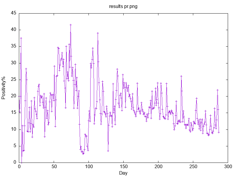
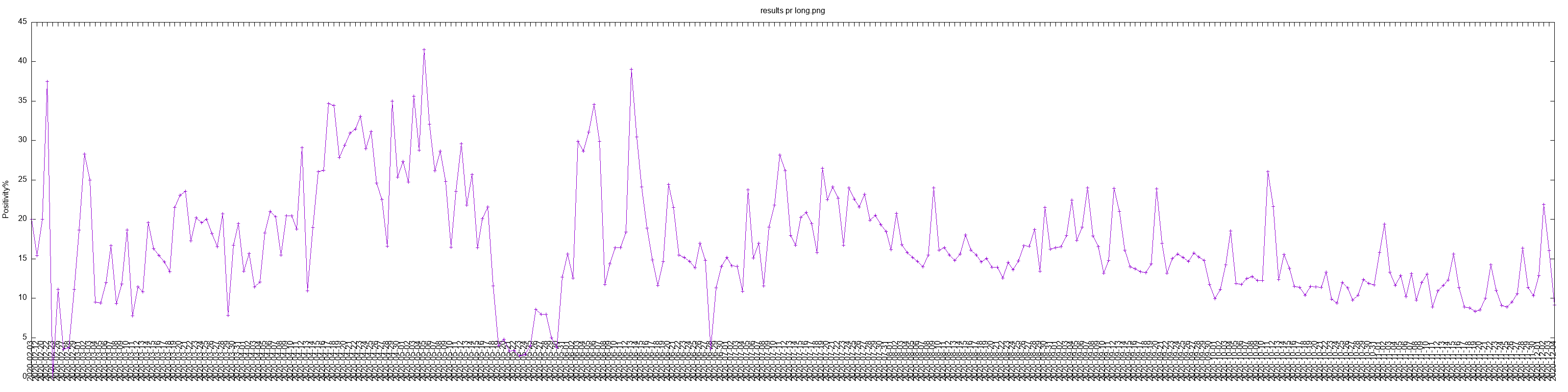
I have been very curious about another type of graphs, that of positivity. As the amount of test number per day have been variable since the pandemics start, I thought it would be helpful if we could analyse the data taking out such a parameter from the equation (in this case, graphs).
For one thing, we should not be keen to analyse the absolute numbers, as there are so many diverging opinions, such as either numbers are over or underestimated.. So they are not much good. Let's check proportions! By the way, that is a tip from John McAfee, who is currently in jail in Spain #freemcafee).
Experimental charts for Covid19 test positivity
How many percentage points of test results are positive to Covid19? I could not find positivity charts around with long time series, so I decided to make some charts with Brazilian data. Below is my try for charting data from Paraná State reports.
gnuplot to show fewer x-ticks and make them more
readable, so that is why it is so wide..To see charts with data from all states, check my corona virus repo.
Analysing positivity rate is independent on test capacity, meaning it does not matter if there is more testing now than at the pandemics start. Everything can be levelled.
I got the data from SUS
OpenData That is not the cleanest data. I extract values for
Positive cases and Negative cases with some
awking.
After download the csv files, you can check the header line which contains the column keys:
% head -1 dados-pr.csv | tr \; \\n | nl
     1  id
     2  dataNotificacao
     3  dataInicioSintomas
     4  dataNascimento
     5  sintomas
     6  profissionalSaude
     7  cbo
     8  condicoes
     9  estadoTeste
    10  dataTeste
    11  tipoTeste
    12  resultadoTeste
    13  paisOrigem
    14  sexo
    15  estado
    16  estadoIBGE
    17  municipio
    18  municipioIBGE
    19  origem
    20  cnes
    21  estadoNotificacao
    22  estadoNotificacaoIBGE
    23  municipioNotificacao
    24  municipioNotificacaoIBGE
    25  excluido
    26  validado
    27  idade
    28  dataEncerramento
    29  evolucaoCaso
    30  classificacaoFinal
The following shell function was used to calculate positivity. The shell will loop through all csv files given and group results by date.
Some awk conditionals will test values from columns
$12 and $30, and will decide if that will be counted as a positive
case, a negative case or be ignored. There is no guarantee this
analysis is sufficient.
You can check the script with some functions to process the data at my sub repo for covid test positivity studies.
The last step is to generate graphs with gnuplot. I
am having some difficulty with the x-ticks dates because
gnuplot only accepts numbers by defaults.. May as it
be, bear in mind the data start from about February and ends on
24th December.
Interpretation
Well, I have been avoiding interpreting Sars-2-Covid data too hastily, as I am learning a lot in this pandemics from a scientific perspective myself..
But the whole point of making these graphs was to try and see if we could get a reading in which gross number of covid tests applied would not be a variable in time analysis.
My experimentation is very rudimentary. I did not try to improve the filtering of the OpenSUS data very much after the initial effort. However, it is well-known from various news outlets that the number of tests taken per day by patients has increased, generally, but we also know it fluctuates over time, i.e test production capacity has increased since the very beginning of the pandemics, logistics has had occasional setbacks to deal with, and also it seem reasonable that less covid tests were applied when positive cases generally decreased, and vice-versa..
With more diligent work onw can smooth out the variable number of covid tests done per day from chart data and surprising results are to be obtained. All available points from historical data sets ought to be used for the results of such an analysis be clear and meaningful from a long term and wholistic perspective.